Foundations · Components · Governance · Adoption
Design System
I co-led Amplience’s first shared product design system, defining reusable foundations and tokens and building a platform component library for products that had evolved separately and diverged.
The system reduced repeated work, brought consistency across products and let squads spend more time on higher-value product problems.
Starting point
Duplication and divergence
Amplience had no shared product design system, so teams repeatedly designed and built the same patterns while products diverged visually and behaviourally. Design and Engineering duplicated effort, while users had to relearn interactions as they moved across the platform.

Discovery
No shared system
Design decisions lived across disparate specifications: hard to find, easy to forget and repeatedly re-specified. Without shared semantic rules, colour, typography, spacing and geometry had drifted. Developers used joke token names like $dove-grey and $cast-iron-grey, showing how arbitrary the foundations had become.

System foundations
A shared source of truth
The Next Generation Authoring squad and I established shared colour, typography, spacing and geometry foundations in Figma and Storybook. They gave Design and Engineering a common source of truth and a consistent basis for defining component behaviour and appearance.

Design language & system
Building the system
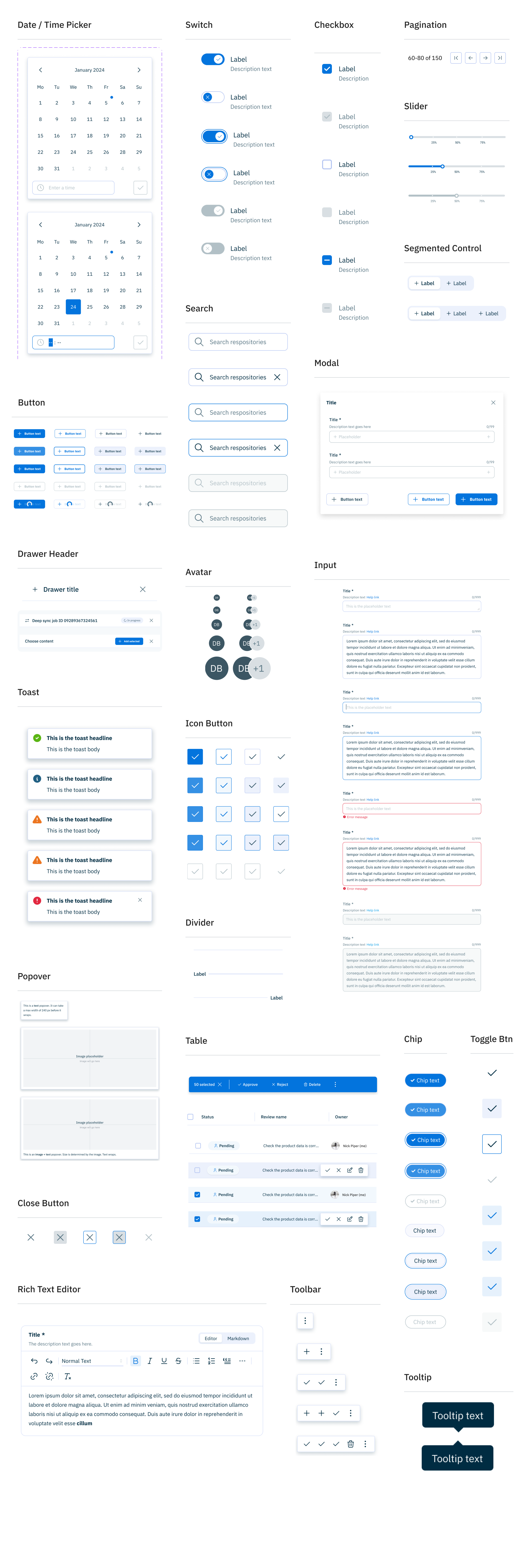
We chose Mantine rather than rebuild common UI primitives, reusing established patterns and adapting them where Amplience needed specific behaviours or outcomes. Next Gen Authoring became the proving ground: usability findings fed the component backlog while I prioritised improvements and defined behaviour, states and interactions for reuse across products.
Component deep dive
A flexible card system
There was strong stakeholder support for cards with large images. My hypothesis: imagery was 2nd-order information. I tested it rather than argue the point. Testing showed labels and metadata were the key to identifying and reviewing content. Rather than a new fixed design, I built a flexible card architecture that prioritised the information each context needed.


Adoption
From adoption to contribution
Previous attempts to establish shared design standards had failed to stick. I worked with the front-end architect to make the case to Engineering and build governance.
Bottom-up contributions were a marker of success. 4 of 6 front-end squads contributed, plus individuals including the VP of Product Development. A squad-owned resource had become a shared platform capability.

Success created new bottlenecks. As contributions became more bottom-up, we had to identify and remove friction from the process. In Development, PR reviews became a constraint. Ironically, by the time I left Amplience, one of the remaining inconsistencies was the name: Design System, Component Library, or something else we could all agree on.